Enlarge (credit: Tom Hounsell)
At its developer day event yesterday, Microsoft spent a long time extolling the virtues of the Universal Windows Platform and the Windows 10 Creators Update to developers. But subtly, the company slipped in a screenshot that gives us a first look at Project Neon, the next iteration of the company’s design language.
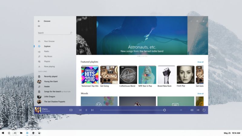
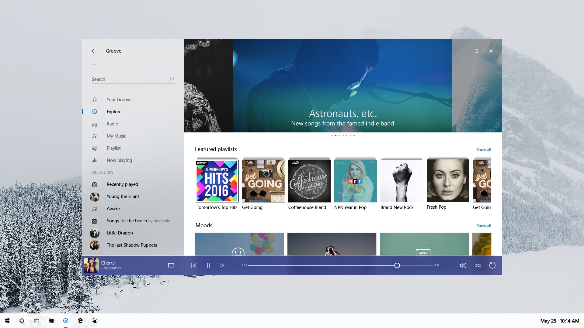
The picture shows a refreshed version of the Groove music app on a Windows desktop. The fundamentals of the app and its layout aren’t changed, underscoring that Neon is very much an iteration of the current Metro/Microsoft Design Language (MDL). The window has shed its discrete title bar and one pixel border, with the application content now extending to the very edge of the window. The search text field no longer has a box around it, and the left hand pane has a hint of translucency to it.
This adds a little more visual interest. While Metro/MDL has long been assumed to require flat expanses of plain color, this isn’t entirely true. High quality and especially photographic imagery are an encouraged part of Metro designs, but this was especially apparent in the early days. Many parts of Windows Phone 7 used “full bleed” (which is to say, edge-to-edge) pictures behind text and other UI elements, and even in Windows 8, some applications such as the Music app were photo-heavy. But this use of artwork is not universal, and in plenty of programs it can be difficult to do appropriately. The translucency in Neon will give developers better ways of demarcating parts of their user interface without requiring the adoption of photos and other artwork.
Read 3 remaining paragraphs | Comments
